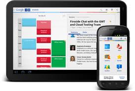
 Over the past month I feel as if I have had countless conversations with on the subject of people who use mobile devices and tablets to search and purchase goods and services. In looking at Google Analytics data for our various clients, it’s obvious that with each passing day people are increasingly comfortable and interested in the immediacy that smartphones and tablets offer when it comes to searching for things to buy that interest them.
What’s fast becoming a problem is the lack of a singular design for a ‘mobile’ page, one that can be used to deliver a smartphone experience as opposed to a tablet experience. As anyone that has a smartphone and/or tablet will tell you the experiences on the two different device types are vastly different.
The statistics are very telling. One of our clients had more than 70% of its online pay-per-click sales attributable to the mobile channel search that resulted in a sale. You’d think the company had a mobile application or website. You’d also be wrong. Yet despite that people came and purchased. While more of those mobile PPC sales occurred on tablets than smartphones, the experience on the tablet (not to mention the smartphone) has not been optimized but people soldier on when they are in their own preferred channel.
The mobile applications for this client are being built as of this moment. But keep in mind that the mobile experience designed for a smartphone will be optimal for that environment but it would be different if the mobile experience were to be designed for a tablet. When it comes to designing mobile content one size definitely does not fit all. Apps are great because they can deliver an experience optimized for the device. .Mobi sites recognize the type of device but if the design is a catch-all mobile design it will need to be dumbed down to the lowest common denominator – the small screen of a smartphone.
When designing your content for mobile devices companies have to consider what most popular activities are and will be for their site. If it’s viewing photos and content then make that the focus of the experience and build around that. If it’s viewing a product list and making a subsequent purchase then make that experience as easy and intuitive (i.e. FAST loading and fast navigation) as possible. I know this sounds too basic and too simple as in – what company wouldn’t do that?
Handling the multi-channel world is more complicated than it’s ever been. Make the extra effort to get it right the first time and you’ll never be sorry. Don’t take the shortcut and vow to fix it later.
You agree?
